Workflow Canvas
Workflow Canvas
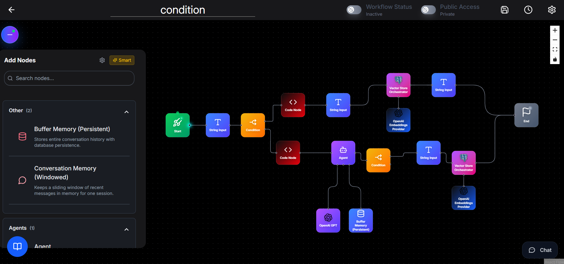
The Workflow Canvas is the main visual builder where you create, configure, and manage AI workflows. Powered by React 19 and XYFlow 12, it provides a high-performance, interactive environment for building complex agentic flows.
The components and interactions of the Workflow Canvas are explained below.
Canvas Toolbar: Provides essential controls for managing workflows.
-
Workflow Name: Click to rename the workflow.
-
Auto-save Status: Displays the current save state:
- Changes saved with timestamp
- Saving… during save operations
- A clock icon shows the last auto-save time
-
Auto-save Settings: Use the gear icon to configure the auto-save interval.
-
Save: Manually save the workflow.
-
Status Bar: Indicates whether the workflow is Active or Inactive.
-
Load: Upload a workflow from a JSON file.
-
Export: Download the workflow as a JSON file or export it as a Docker package for deployment.
-
Delete: Permanently delete the workflow (confirmation required).
-
Active / Inactive Toggle: Enable or disable the workflow.
-
Public / Private Toggle: Control the visibility of the workflow.
-
Last Saved Timestamp: Shows when the workflow was last auto-saved or manually saved.
Node Sidebar: Appears on the left side of the canvas and contains all available nodes.
- Smart Suggestions Toggle: Used to enable or disable AI-powered node recommendations.
- Settings: Used to configure smart suggestion preferences.
- Search: Used to filter nodes by name or description. Results update in real time.
-
Recommended Nodes: When Smart Suggestions is enabled, AI-recommended nodes are displayed based on the current workflow.
Recommended nodes are marked with a sparkle icon. Click a node to add it to the canvas. -
Node Categories: Nodes are grouped into expandable categories. Each category displays:
- Category name and node count
- Collapsible panel
- Node icon and name
- Short description on hover
Working with Nodes
Adding Nodes
- Open the Node Sidebar.
- Locate the node using search or categories.
- Drag the node onto the canvas.
- Drop it at the desired position.
Node Appearance
Each node displays:
- A rounded node card with a gradient background
- A unique node icon
- Node name
- Input handles on the left and output handles on the right
- Handle labels shown on hover
Node Interactions
- Single-click to select a node
- Double-click to open the configuration modal
- Drag to move the node
- Hover to view connection labels and delete button
Connecting Nodes
To connect nodes:
- Hover over a node to reveal connection handles.
- Drag from an output handle to an input handle on another node.
- Release to create the connection.
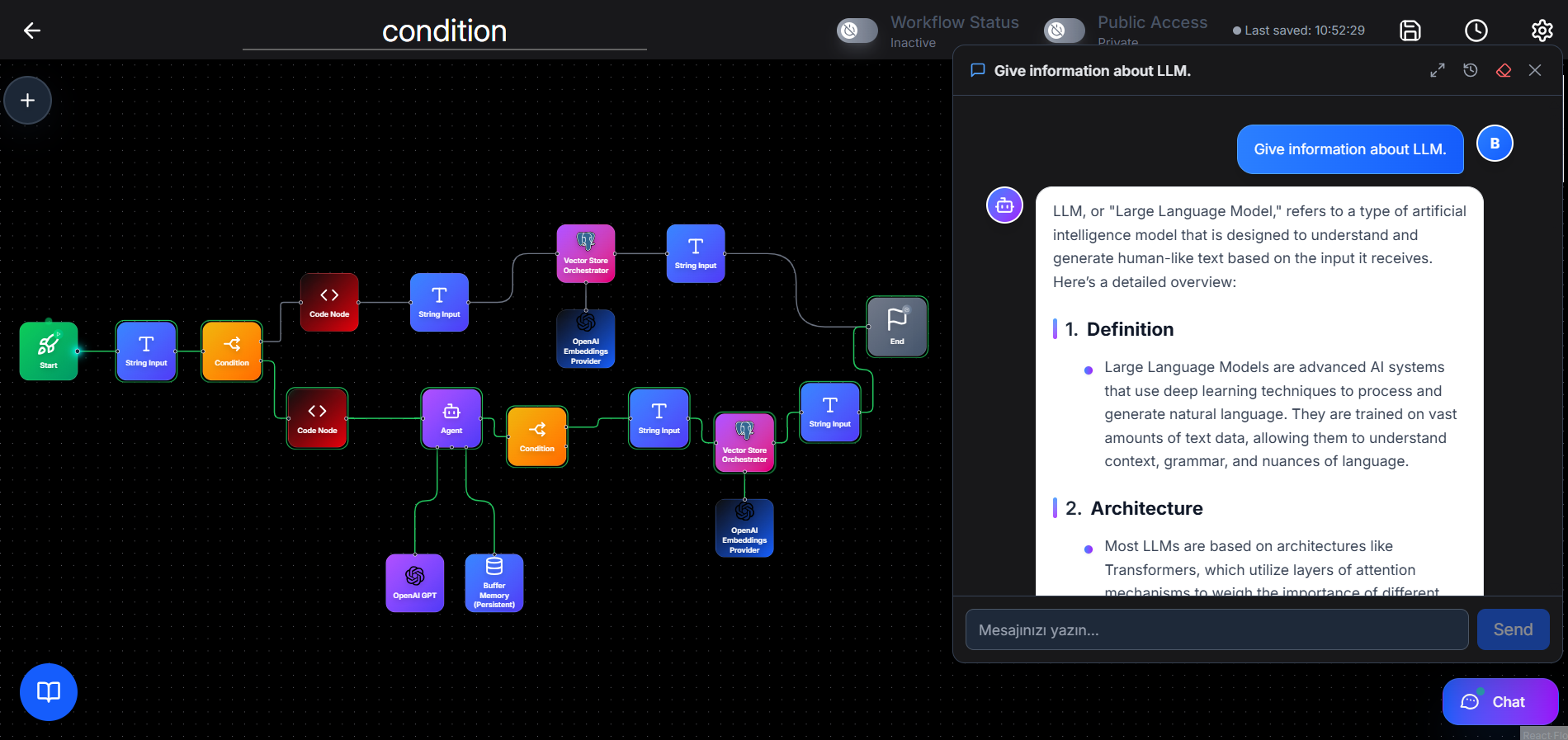
Connection lines animate during execution and display status colors:
- Green for successful execution
- Red for errors
Deleting Nodes
- Click the delete icon on hover or select the node and press the Delete key
Special Node Controls
Some nodes provide additional actions:
- WebScraper Node: Start or stop scraping
- HTTPRequest Node: Copy the generated cURL command
- WebhookTrigger Node: Start or stop listening for webhooks
- TimerStart Node: Start, stop, or trigger the timer immediately
- KafkaTrigger Node: Start or stop Kafka consumer listener
Node Configuration Modal
Double-clicking a node opens the fullscreen configuration modal. Left panel displays node details, including:
- Node icon and name
- Description
- Input parameters with types
- Output parameters with types
Right panel contains the configuration form, which is dynamically generated based on node type. Supported field types include text inputs, dropdowns, credentials selection, JSON editors, code editors, sliders, and date/time pickers. Some nodes include multiple configuration tabs for advanced settings. Code nodes feature a built-in Monaco Editor with syntax highlighting, auto-completion, and inline validation for Python and JavaScript.
After execution, the modal also displays:
- Input and output data
- Execution status
- Connection details
Configuration changes are saved automatically or by clicking Save.
Chat Panel
The Chat Panel allows you to test workflows directly from the canvas. Click the chat bubble icon in the bottom-right corner to start a chat. User guide için sade ve net bir ifade:
You can edit or delete user messages. Editing a message triggers a new AI response.
Chat History: allows you to view previous conversations.
- Displays conversation previews and timestamps
- Click a conversation to reload it
- Start a new conversation or delete old ones